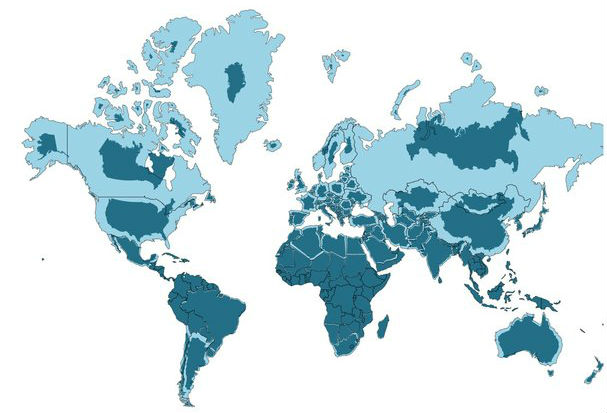
The Mercator Map Projection with the true size and shape of the country overlaid.
Credit: Neil Kaye/@neilrkaye
This animated map shows the true size of each country
Everything is relative.
27 August 2019

Neil Kaye/@neilrkaye
The Mercator Map Projection with the true size and shape of the country overlaid.
One of the best known and commonly used world maps, the Mercator Projection, depicts Greenland and Africa as being roughly the same size. In reality, Africa is 14 times larger.
This clever animation by Neil Kaye, a climate data scientist at the Met Office - the United Kingdom's national weather service - shows what the Mercator Projection would look like if it depicted the true size of each country in relation to others.
Suddenly, we see countries like the United States, Canada and Russia shrink (and separate, so that seas appear where there are none), while the giant landmasses of Africa and South America remain more or less the same.
Australia, which is the planet's sixth largest country by size after Russia, Canada, China, the US and Brazil, also remains consistent across the animation.
Originally designed to be a navigator's tool, the Mercator Map Projection has for centuries been a mariner's best friend, because it represents lines of constant true direction, which means a straight line connecting any two points on the map will travel in the same direction that a compass would show.
The way it’s designed means that objects closer to the equator appear in relative scale to one another, but objects closer to the poles appear larger than they are.
In the 1980s, it became widely used in classrooms to teach geography, and until 2018, was Google's choice of map projection.
In recent years, much has been made of the distortion it applies to relative country landmass size, but Kaye’s animation drives the point that it was designed for nautical purposes rather than as an educational resource.
Showing the Mercator Map Projection with the true size and shape of the country overlaid#dataviz #maps #gis #mapping pic.twitter.com/Gqr1Dd8YrM
— Neil Kaye (@neilrkaye) August 14, 2019
As Nick Stockton points out at Wired, “It’s really not a bad map. It’s just been in the wrong place for a long time.”
Read next:
This clever map visualizes Earth's population as a 'human terrain'